Noggin is an Austrailian-based crisis management software company that specializes in Emergency Response Services and logistics management.
In 2016 I was tasked to produce a global rebrand, including a new corporate identity.
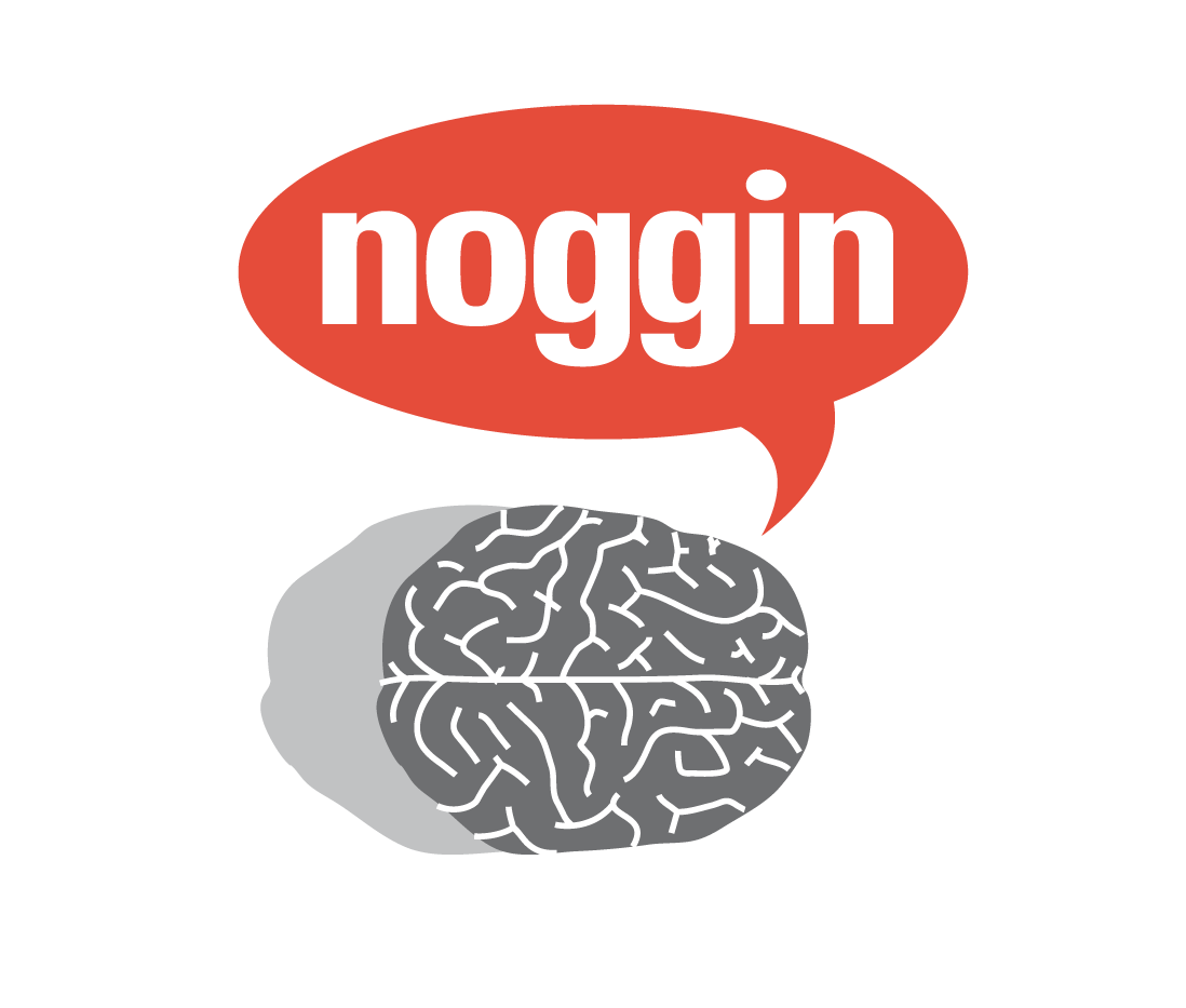
Original logo

2017 rebrand
The Situation:
In 2017 Noggin CEO James Boddam-Whetham approached me with the request to begin the process for a full corporate rebrand. I had been working at Noggin for just over a year at this point, and James and the board of directors were impressed with the work I did in bringing the brand into a new design direction with my illustration skills. James wanted a new direction for Noggin, one that kept with the company ethos: “Keep Your Mind in the Clouds, But Your Head on the Ground.”

The Task:
I lead creative direction for the duration of the rebrand from start to finish, reporting directly to the CEO. The rebrand would start with an extensive logo study and redesign, working from there a style guide was to be constructed to which the brand’s ethos was to be explored along with the core values.
From there every single aspect of the corporate identity would be overhauled, from the website, the published white papers, marketing materials, to every last asset the sales department needed to successfully curate new accounts. It would also be my responsibility to also train future junior designers on the visual style of Noggin going forward.
The project would take about 2 years to complete, with the logo design taking about 4 months. Over the course there would be several stages of rollout, with some adjustments along the way based on feedback from marketing and sales departments.
The Project:
The first steps for the rebrand involved consulting the CEO for notes for the themes, inspirations and preferences of all stakeholders involved. Using that survey as a rudimentary moodboard I proceeded to produce 50-70 sketches as options for designs that he narrowed down to 30. I refined them digitally to a rough concept that he then narrowed down to 10. I made a group of logo studies into 4 groups of logos and presented them to the board of directors. A final 4 were selected, with #1 being selected to develop into the final design.
Using the new Noggin branding gave us flexibility to migrate from old to new and offered the CEO the ability to request changes faster and with better simplicity. It was a relatively quick process, as James followed the project closely, offering precise input while allowing for an openness to explore.
Noggin’s rebrand was a rolling process, with a strong focus on adapting incremental shifts to each section of the site and assets over time.
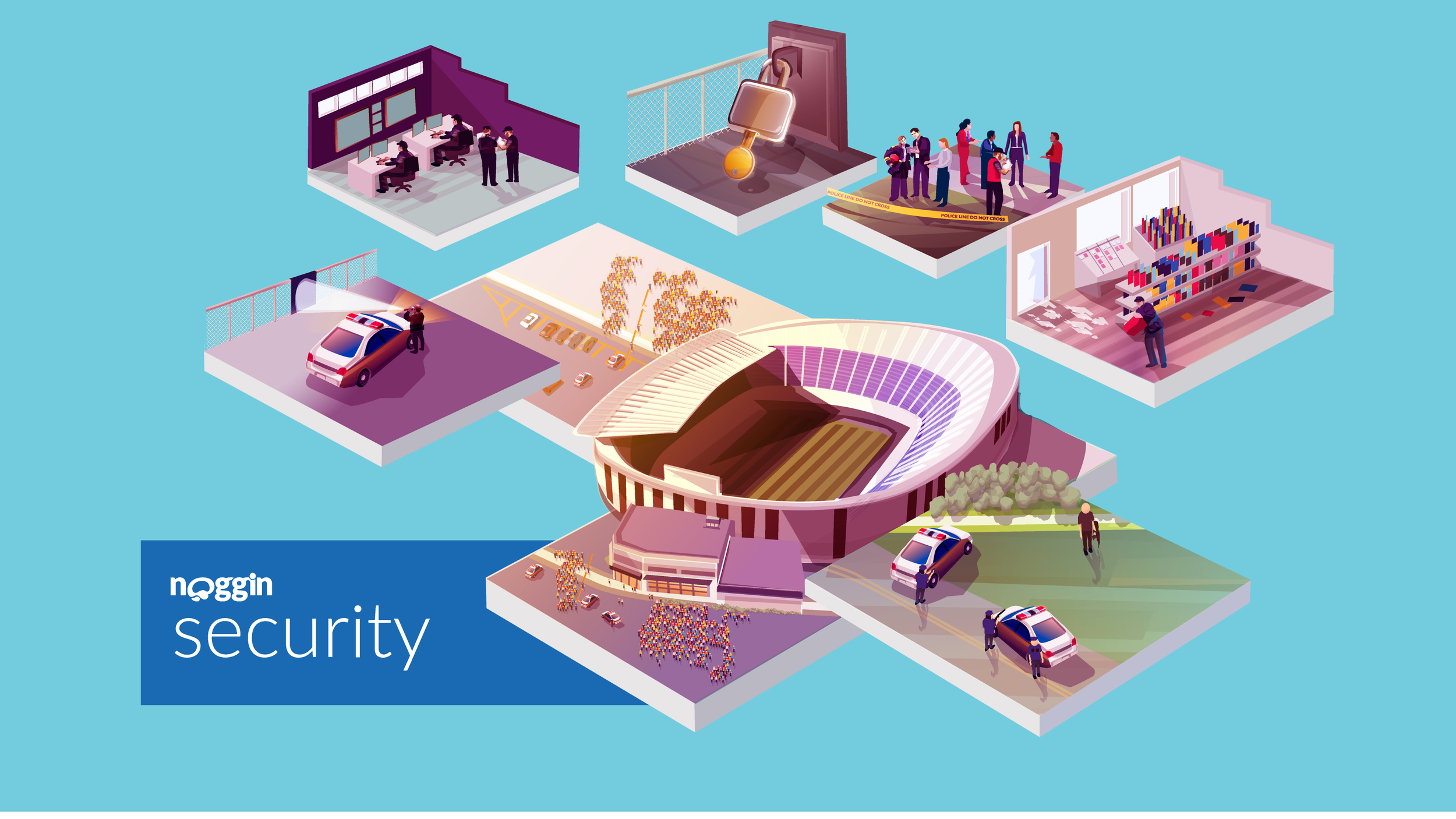
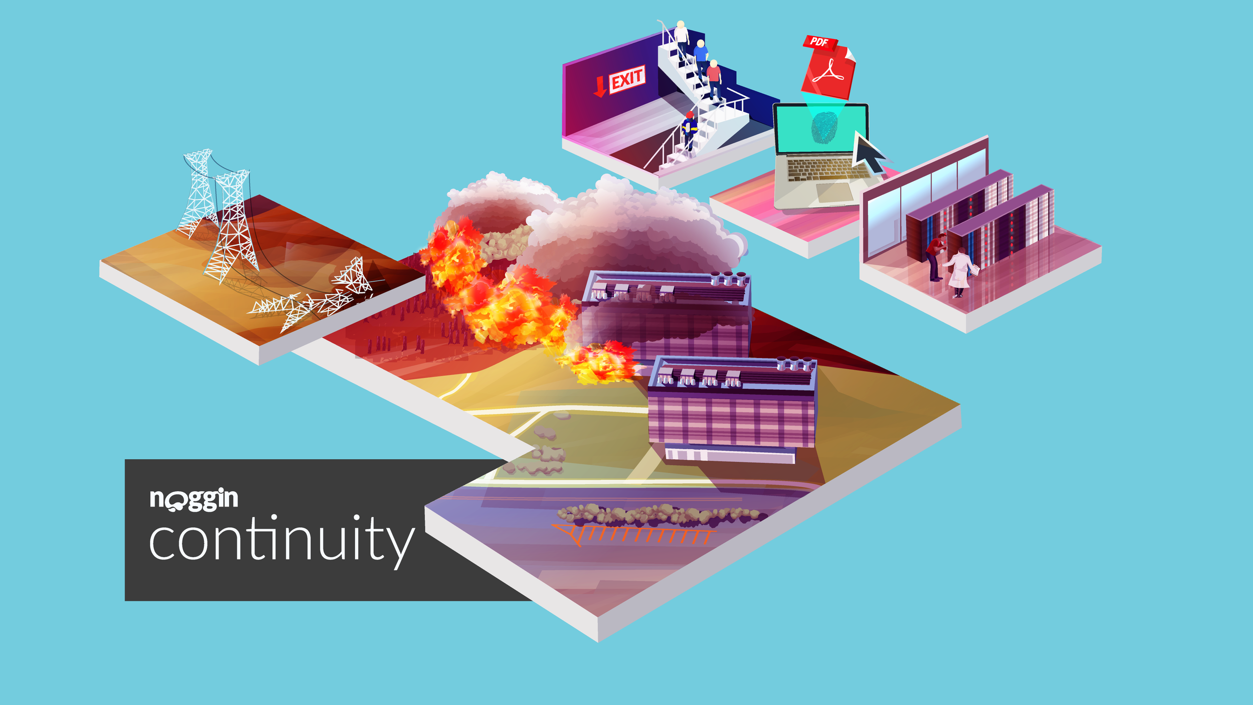
Evolving the brand illustration system
I slowly evolved Noggin’s identity through 2017 as I created new brand elements whenever promotional materials demanded. Illustrations were the biggest push for this redesign, based at the request of the CEO for something that was “visually dynamic and different enough from competitors to truly stand out.” The majority of brands that operated in crisis management were extremely formulaic in their illustrations, often sticking with minimalist iconography that was indistinguishable from their competitors. Furthermore the sincerity of the industry meant that it suffered from a conformity of professionalism, despite the subject matter of crisis management being incredibly dynamic and essential for society at large. The opportunity was there to try something bold, and after consulting with the sales department for suggestions I slowly evolved the illustrations to a more realistic and dynamic visual language.


Marketing materials for print and web
The Marketing department relied on extensive print and presentation materials to drive sales and increase accounts with major contracts.One of the lasting pieces of information I’ve held was how the teams found promotion far easier when there were colorful and engaging materials that instantly stood out compared to the far more somber contributions from competitors. One of the most senior sales reps said “It’s night and day, these brochures always catch clients eyes.”


Minimal icon designs for white papers:
While many of the illustrations at Noggin were incredibly detailed and colorful, there were always a need for presentations or white papers to have a more minimal approach.
To balance the two ecosystems, Noggin blue colors were used exclusively. This allowed for a consistency with the full-color advertisements, while also offering a set of icons that could double for presentations as well.


Results:
Noggin’s rebrand dramatically improved the company’s ability to expand clients and secure new contracts which included partnerships with Deloitte and Red Cross.
The following other goals were achieved through this project:
Sales department confidence: For years the sales department requested a significant investment in improved presentations, marketing materials and documentation to assist in contacting and securing new prospects. Feedback from the team was beyond expectations, including the marketing lead stating that “I don’t know how we could have done as much as we did in 2017 without such good marketing materials.”
Faster turnarounds: For years presentations were often a slower pipeline due to disparate icon sets, delayed output for custom designs, and limitations to what could be presented using rudimentary assets. Creating a suite of icons and illustrations improved pitch decks while increasing turnaround by 25%. By end of 2017, deck production had doubled.
Vastly improved documentation: Once the design team expanded, asset libraries were created so future teams could utilize icon sets to modify and augment along with the brand, instead of needing new sets for each project. Evergreen assets finally had become the norm at Noggin.
I was really grateful to work at Noggin, especially because of the CEO being so open to fresh ideas, and giving me the space to experiment and explore the possibilities of the brand. It’s rare to have an opportunity to work so directly with stakeholders, and it was refreshing to have that confidence in knowing that decisions could be quick and solutions adaptable.