

In 2019 I became a part of Google Developer Studios.
Billed as Google’s internal production studio Google Developer Studios (GDS) is an essential part of Google’s developer outreach, creating educational content with the goal of expanding accessibility and growing user bases across all of Google’s brands. At GDS I was tasked with a massive variety of design tasks, from show production, storyboarding, illustrations, animations to web design elements and diagram design standards for internal and SaaS uses.
Google Developer Studios - Animation
Cloud Bytes
Cloud Bytes is a series developed to explain the various cloud products in under a minute. It’s a fast-paced quickly turned around project including 20+ videos made starting around 2020. Often several episodes would be worked on at the same time, and asset management was essential to complete.
Discovering Data Centers
Discovering Data Centers is a series requested by the Google Cloud engineering leads who wished to showcase the various details of how data centers at Google worked, with a feature on the many ecological and green-energy based solutions the newest data centers were implementing globally.
The 6 episode series took approximately 6 months to complete, with each episode ranging in the 8 minute range. The biggest challenge was finding the right balance between information density and visual narrative flow.
Building boards:
Working close with the Google Developer Advocate and the animator, we develop a series of storyboards for each episode, all with production cycles in mind. It’s a careful balance between displaying information in a fun way without disrupting the series pipeline with levels of complexity that could hamper animation turnaround.
To frontload this challenge, I worked closely with animation during the first board developments to make sure no one transition or scene was out of spec for the series’ allotted time frames.
Discovery Data Centers was one of nearly a dozen other fully animated series, this one in particular going on for more than 10 episodes over the course of a year.
It was incredibly satisfying to strike this balance of creativity with deadlines. There’s a certain level of finesse necessary to assess and understand the parameters of a project, and set out to achieve the vision of the producer while making sure elements shipped within Google’s product launch schedule.
Google Cloud
solution architecture brand system

The Situation:
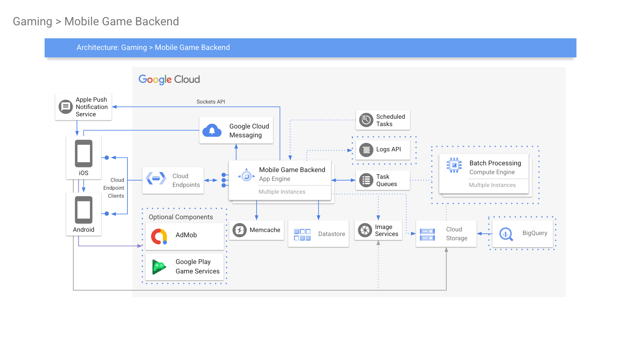
Architecture diagrams are a collection of icons and structures that assist in providing a visual explanation for complex software and hardware systems. They are very info-dense, and absolutely essential in explaining to programmers how their systems function. They however have one discrete limitation of visibility.
The Task:
These diagrams often appear in many of the productions that GDS creates. Often hundreds of videos a year need a method to convey this information without losing the developers who are watching.
To further complicate things, 75% of ALL video views were coming from cell phones.
I had to develop a functional system for showing structures and hierarchies that not only conveyed the information, but did so within the confines of smaller screens, and with higher contrast ratios to comply with WCAG 2.0 standards.
The Project:
Working with GPJ to implement the complete draft of the diagram guide, I outlined several key parameters that this updated must achieve:
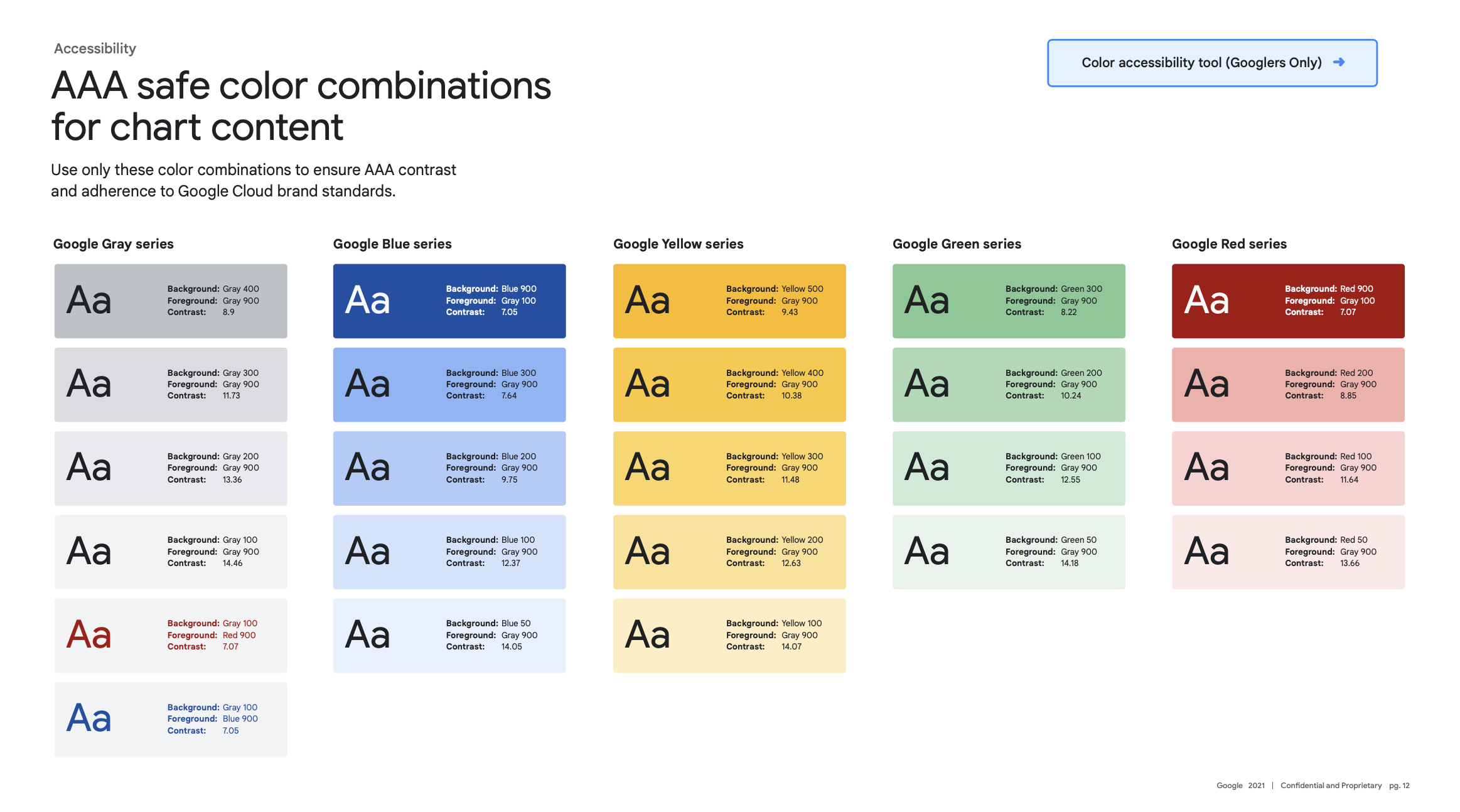
Normal text must have a contrast ratio of 4.5:1 (AA)
Large text must have a contrast ratio of 3:1
(Large text = 14pt (18.66px) and bold or larger, or 18pt (24px) or larger) (AA)
Non decorative graphical objects must have a contrast ratio of 3:1,
such as nesting zone boundaries, pathway arrows, cards, and icons (AA)
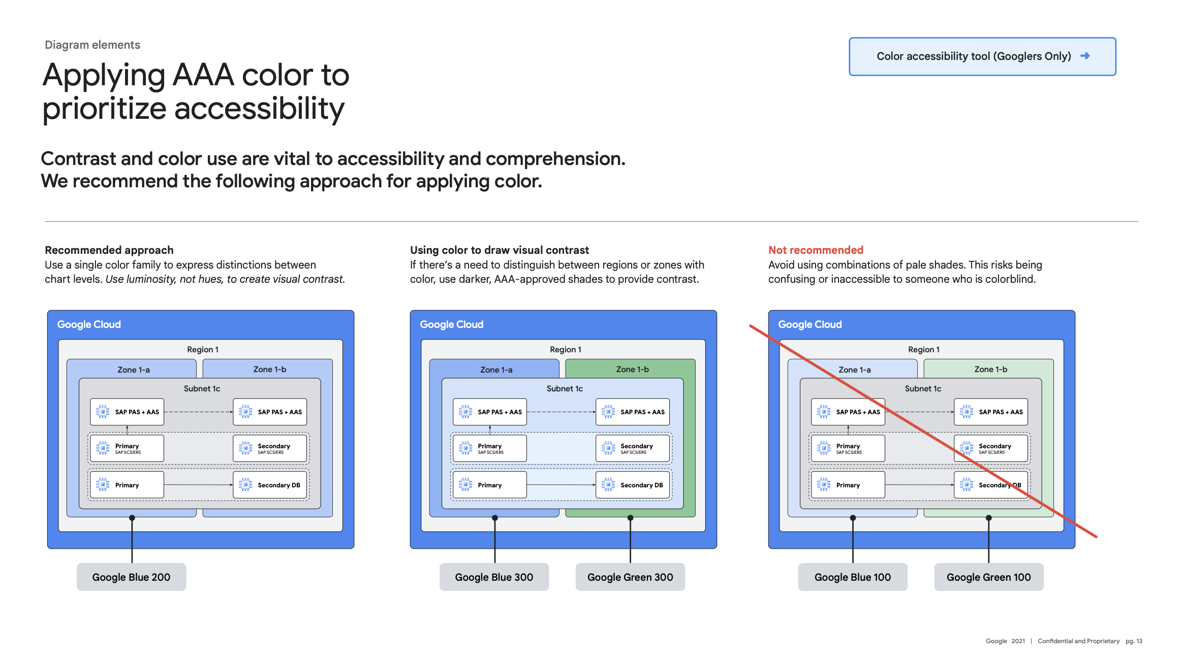
Graphical objects like nesting zones and pathways must
have another visual means of conveying information outside of color alone (A)
If possible, diagrams should include alt text. PDF documents
should be tagged to ensure proper reading order. (A)
Normal text must have a contrast ratio of 7:1. (AAA)
Large text must have a contrast ratio of 4.5:1
(Large text = 14pt (18.66px) and bold or larger, or 18pt (24px) or larger) (AAA)

Build & test
It was essential to build the system as robust as possible, with clear color and branding to best accommodate for the wide varieties of architectures that GDS worked with. Once I performed enough A/B testing with new users, I began work on adapting the style to various brands like Firebase, Flutter and Android with custom icon sets, specific colorways, and even font packs that aligned with branding updates as time passed.
Making critical information visible to all
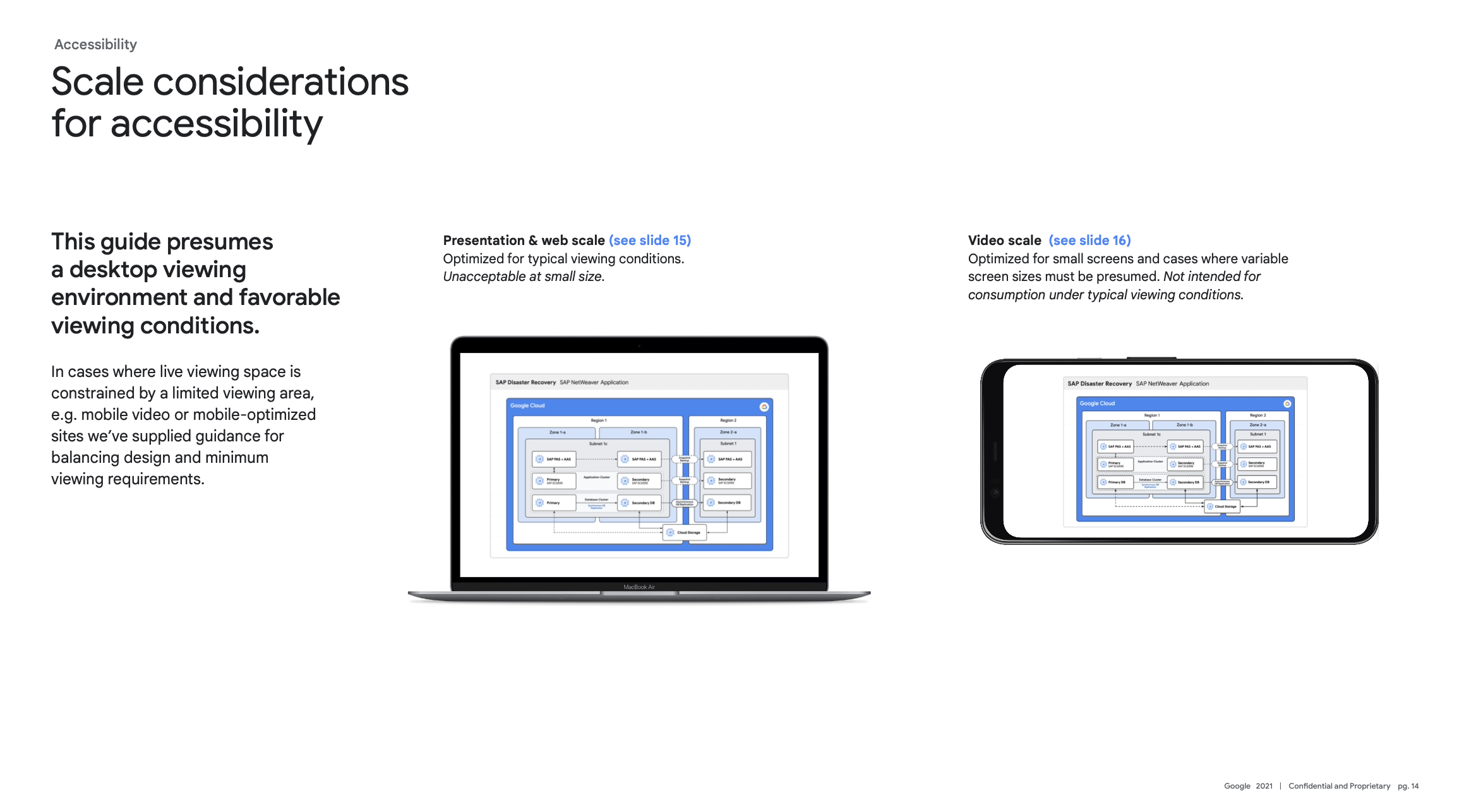
Over a dozen shows utilized this system, and that resulted in developing multiple variants for specific use-cases. Often videos would have cut-out sections for the host. There were a set of slides meant to increase all elements by a ratio that would maintain the minimum type size for smaller screens.
This included 16:9 video as well…
The majority of productions at GDS included promotional YouTube shorts that would require their own set of mini animations to complete.
It was essential to make sure these elements could translate in a minimal form to short-form video.
Results:
Visibility is a key issue when presenting complex diagrams. Bringing GDS videos to compliance was a much needed project, especially since the mission of these videos is for community educational purposes.
The following other goals were achieved through this project:
Vastly improved visibility: While not every use-case will offer AAA compliance, GPJ was able to get within the allotted AA for only a handful of instances.
Better diagram solutions compliance from Developer Advocates: I was able to obtain better turnaround times for videos (up to 10% in the first quarter of implementation) simply on the reality that having such documentation meant there was something I could point the Developer Advocates to when it came down to compliance with their video productions.
Updated video deck templates: I spent the remainder of the month after the launch of this brand guideline implementing animation solutions to the design deck and shipping it out as templates for the Developer Advocates. This also reduced turnaround time, as now drafts of the decks could have some animations in place, instead of needing to add it at the last half of the production cycle.
I’m very proud of the work GPJ did in helping make my initial compliance standards achievable. It was extremely satisfying to work with GPJ to take the concepts, outlines, and starting design points to produce a comprehensive and compliant brand system that could be used for years to come.