
My time as a graphic designer at Make: Magazine was both prolific and special.
Back in 2013, I was contracted to do design for Make Magazine. Within 8 months I became a full time employee, and I worked alongside the creative director across all publishing projects from the magazine layouts themselves to books, project tutorials, and even writing articles.
My passion for Make: is built around the core belief that anyone can learn and grow through projects and creativity, and the educational spirit that made my time at Make rewarding still informs my creative directions to this day.
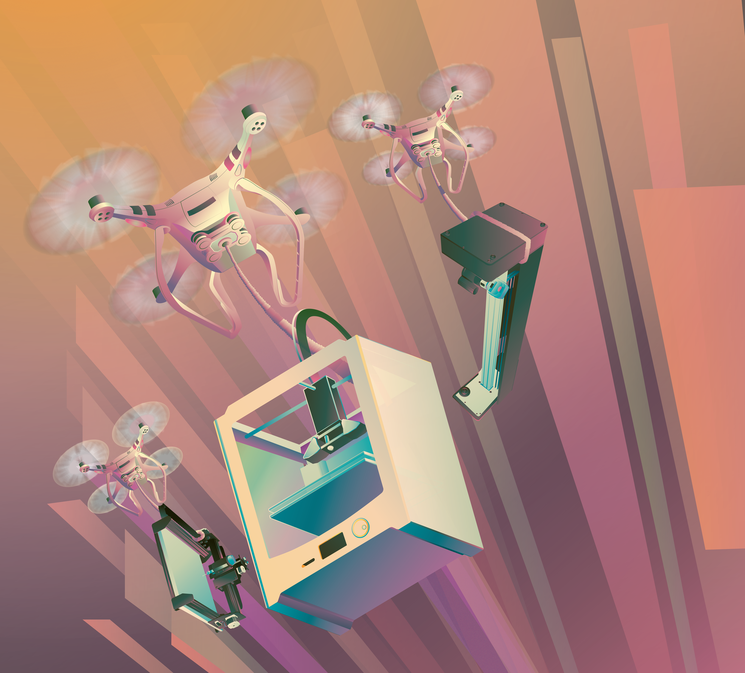
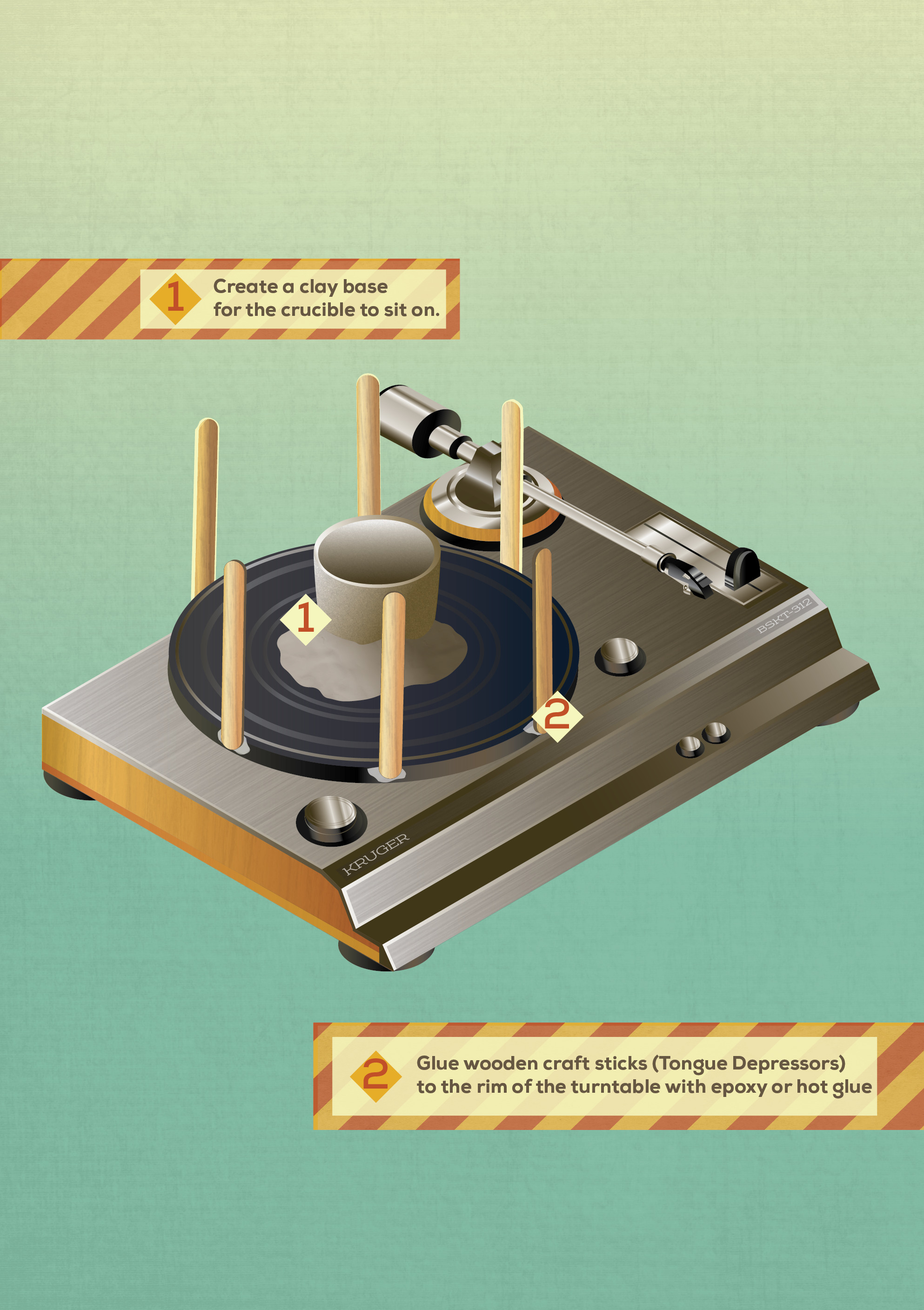
When I started for Make magazine, I first was tasked with illustrations and technical drawings
Make prided itself on having easy-to-understand tutorials and guides for projects, which required careful design considerations when making technical drawings paired with appealing illustrations.
Work needed to be fun, but clear. Ideas had to be focused but not dull. You had to design to an audience ranging from excited children to seasoned professional adults.
This was one of my first deep forays into infographic illustrations, and the power of distilling complex ideas into something that was engaging at the same time.
Soon, I had complete creative control of magazine sections
Once I had shown my competency with visual narrative, I soon was given entire articles to design for. One such instance the Art Director told me that we had a really interesting feature about high school students fighting pollution, I jumped at the chance to give it a very different typographic feel than what we traditionally create.
When our copy editor approved the title "Grime Fighters" I began work incorporating the letters in a grungy and greasy depiction.
With a heavy stroke contrast and flagrant use of a curvy leg on the "R" I wanted to give an unnerving weight to make the lettering feel as sticky as possible. The tails and terminals easily dripped with oil, and I never drew a single crossbar straight to give it an extra accentuation.
Skill Builders
I'm drawn by the desire to use spectacle to push narrative, and that even the most mundane learning task can be framed in an appealing way. Skill Builder is my expression of such possibility by providing an easy-on-the-eyes flow through complex subject matters that equip the reader with what they'd need to know to get started.
This of course, requires considerable planning.
Skill Builder requires far more participation with the editor than any other section in the magazine. Often we would have a meeting months in advance discussing each topic being covered and I would enforce an "explain like I'm five" rule of thumb to determine the level of accessibility of a concept.
This rigorous process involves a lot of communication to work. I have to trust the editor to be knowledgable as much as they would trust my ability to visually prioritize the information.
Specialized editorials
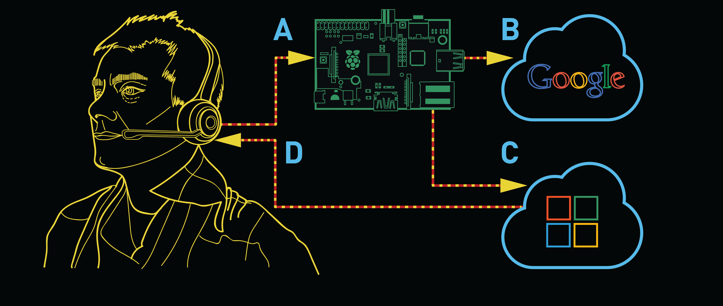
One of the pleasant aspects of maker culture is the increasingly visible attempts by major organizations to better understand the world around them. The New York Times founded a department that focused on hardware development that assist editors and journalists better systems of documentation, including the depicted interview table.
The feature focuses on the three members of this "hackerspace in a newspaper" their origin stories, and the quest to find more intuitive ways to capture data.
I was enchanted by Noah Freehan's quirky passsion for technology and how the office practically gamified their pursuits. This inspiration drove my pixelated aesthetic, with the specific goal of depicting the department heads in a distinct 16-bit portrait.
Upon receiving their printed copy of Make Noah immediately emailed the editor to praise our attention to detail: Noah purposefully shaves a small square out of his red beard, and his digital affectation was exact!
It's emails like that which make the extra effort completely worth it.
Maker Features
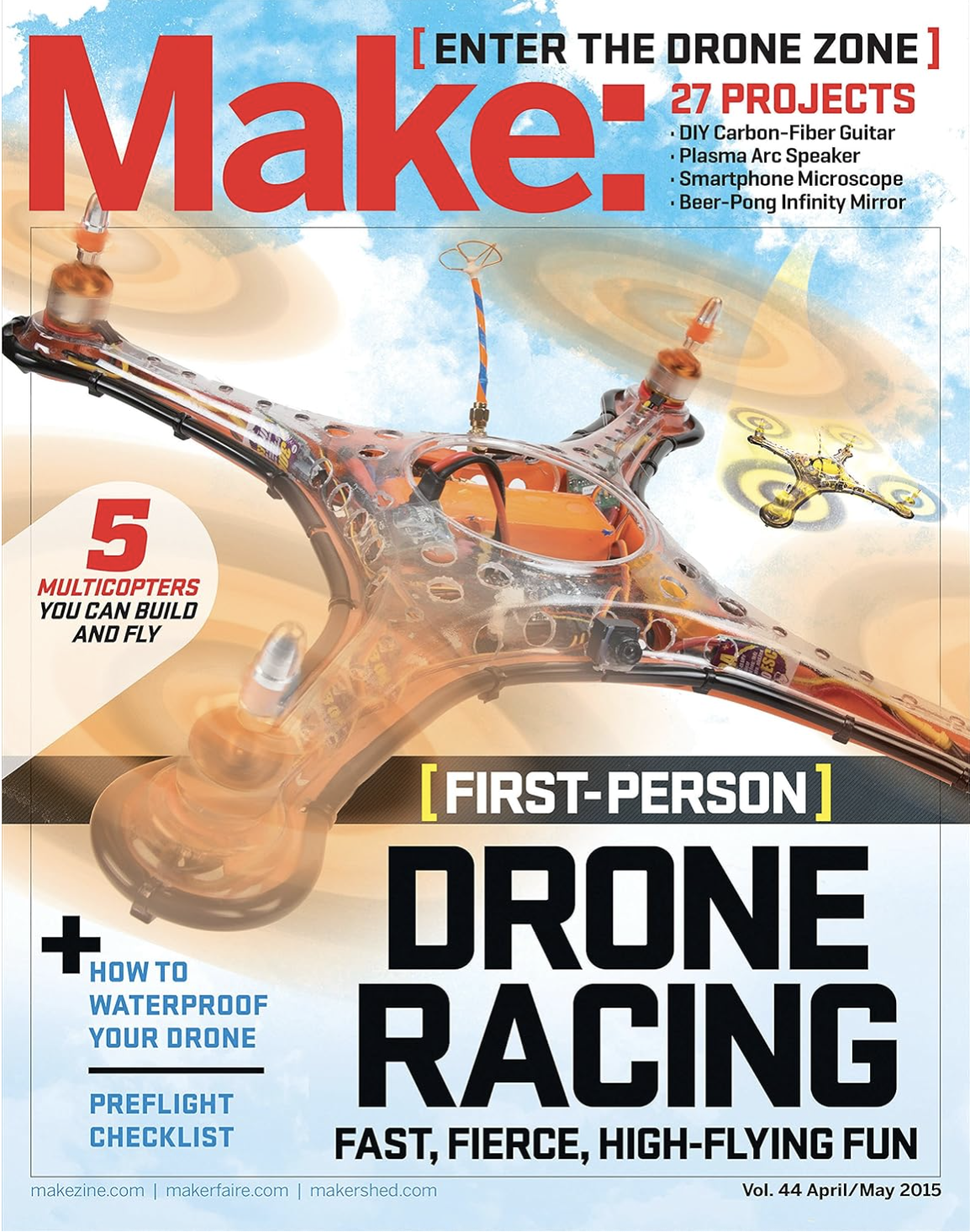
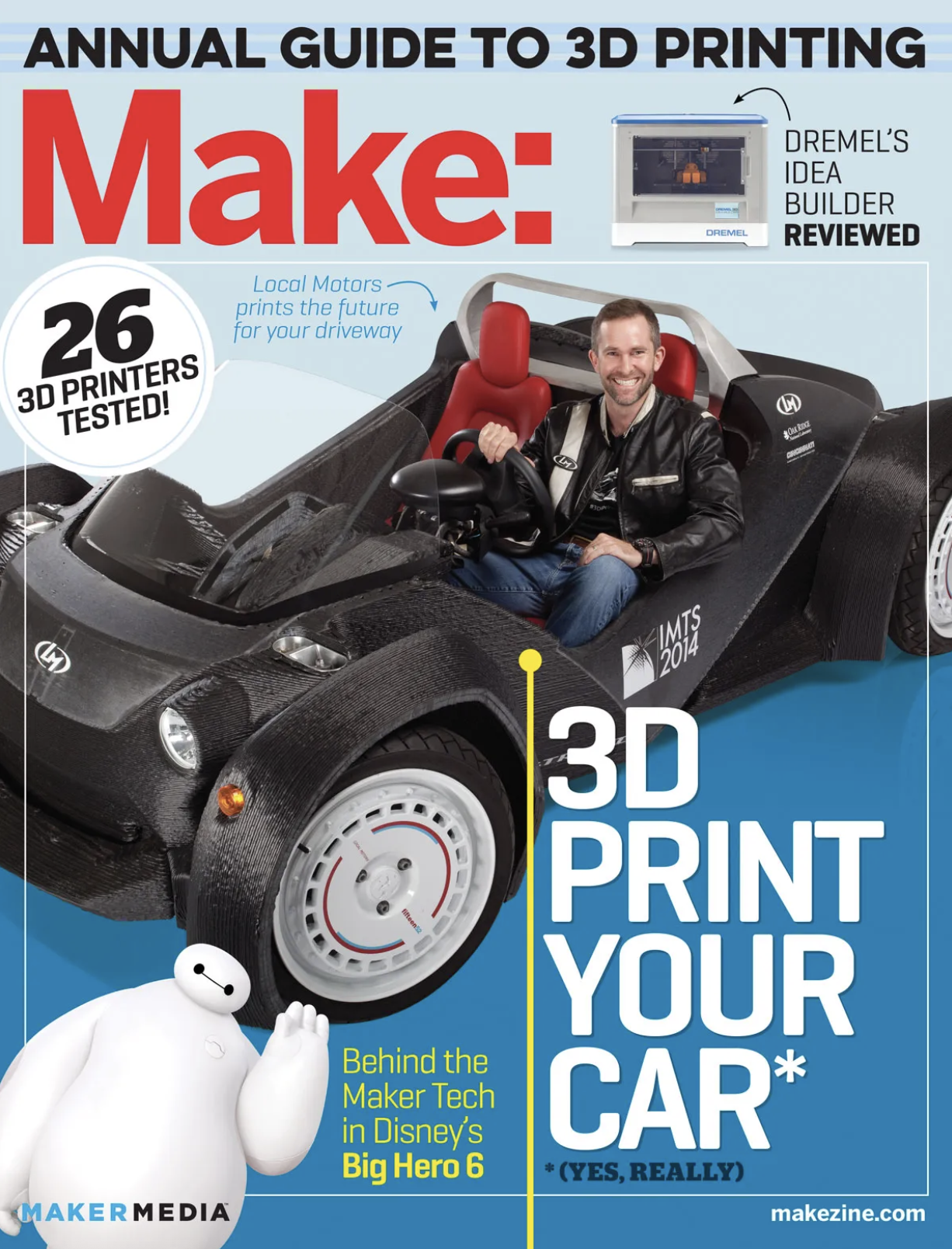
Make: Magazine isn’t just tutorials though, it’s also the makers themselves. These are typically the cover stories, and one of the most visible aspects of the magazine.
For multiple issues I was tasked with layouts for these feature spreads, and it was always a priority to find a way to imbue the personality of the maker into the layout themselves.
Photography helped dictate the look and feel of the special sections. Finding a way to tell a story with the photoshoots was just as important as creating all the collateral art and illustrations that helped tell the story.
This resulted in working directly with the photographer during this process. Maintaining that level of collaboration across editors to artists was a common feature of the print magazine process.
One of my favorite examples of this process was the photoshoot with Nicholas Huchet who had engineered his own artificial limb after years of expensive and sluggish updates from previous companies for his own accessibility.
The story is an essential one: a person who needs an affordable solution but has to carve their own way. It’s truly inspiring but also important to get the word out to others who are in similar circumstances.
The illustrations and layout kept him in the limelight. This was his work his DIY solution to a very impactful problem that hundreds of thousands of people experience.
The circle theme was built around a pair of quotes he made in the interview. The idea of this narrative coming full circle; from needing an artificial limb to becoming a small mini-factory himself to provide others the same, really resonated with the editors and author.
I was really pleased with how this turned out, the turnaround time was especially tight for this layout so when the pieces finally came together it was like a puzzle settling into place.
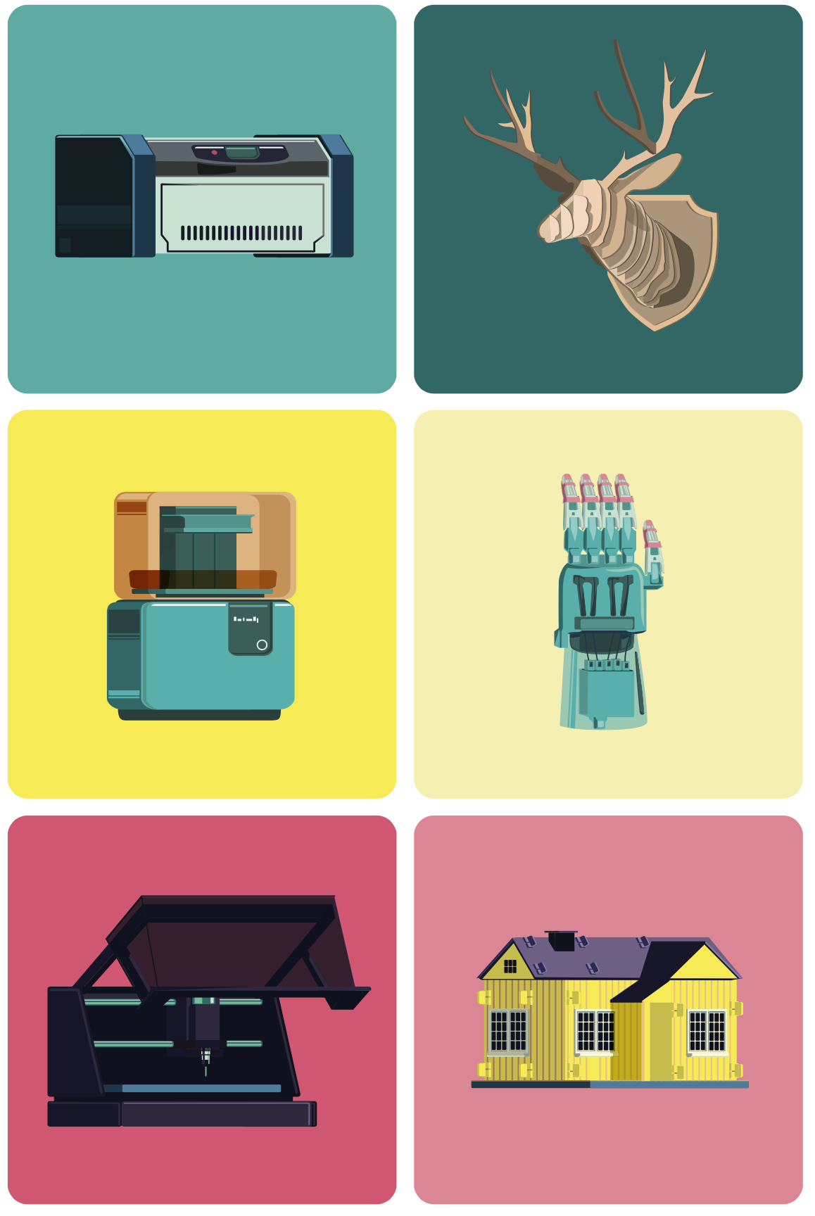
Make Books
Make also produces a wide range of books aimed at audiences young and old with skills ranging from novice to expert.
One such example, Paper Inventions by Kathy Ceceri, featured a wide range of colorful paper-based projects for younger students to experiment with engineering and electronics.
I based the layouts and illustrations on the bright paper-theme throughout the book, focusing on using simple shapes to guide and engage the reader along each project.
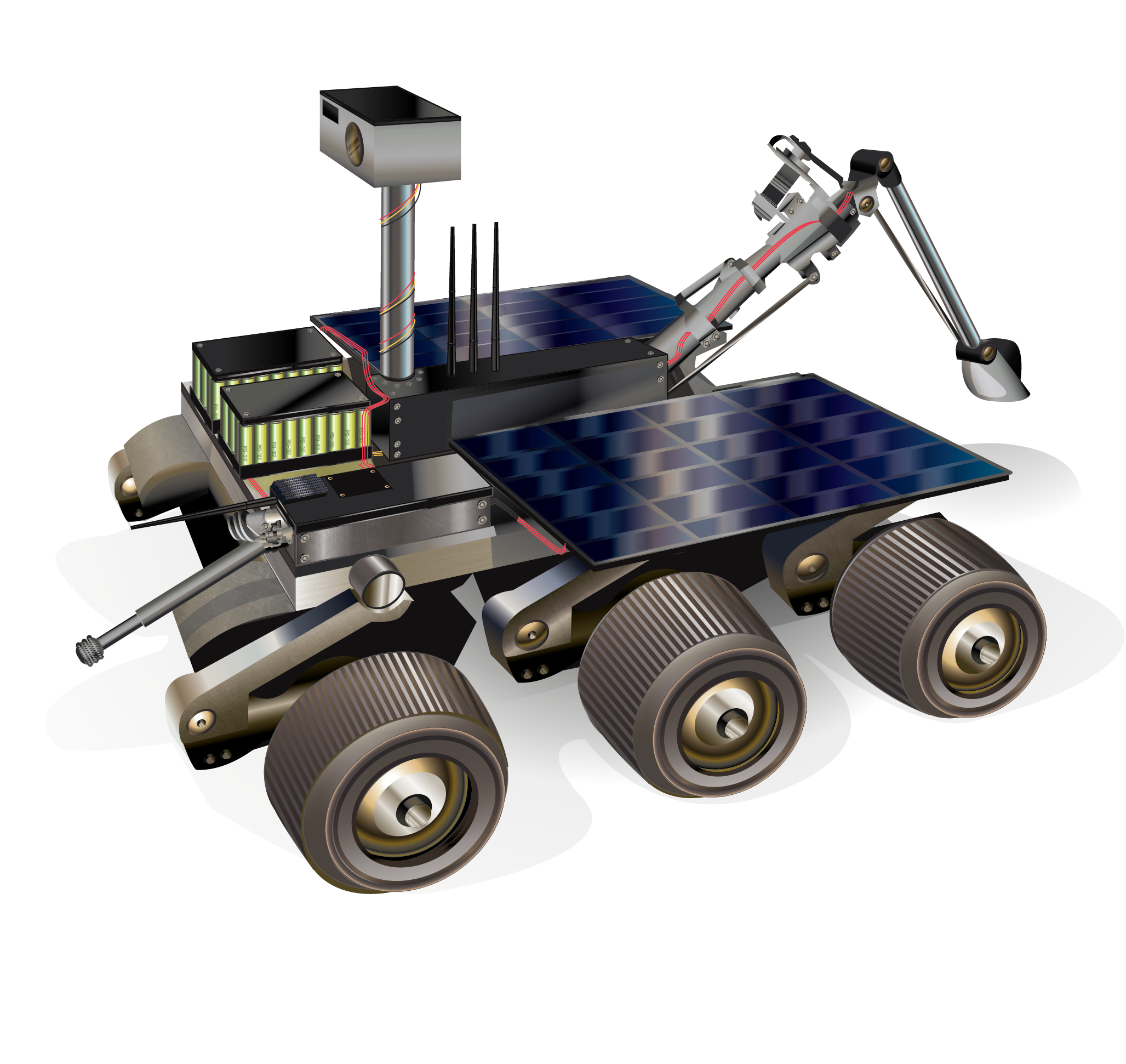
Make : Robotic Arms
Matt Eaton wrote a comprehensive guide to one of the most comprehensive guides to beginning robotics. The series of projects guides the reader through easy-to-follow steps from the robotic arm construction through programming it.
For this book I opted to have a more futuristic schematic aesthetic, to offer some space between all the trigonometry and programming code blocks. I handled all the illustrations for this book, and provided consistent layout palettes so that the sections maintained a strict continuity along the journey of building their first robot arm.
The secondary imagery was also inspired by the parts list and some of the various components used in the project.
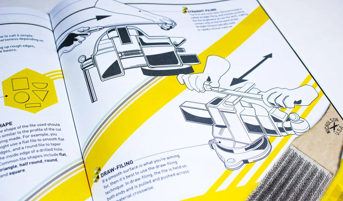
Make: Skill Seeker
Steph Piper made a young maker edition of her Skill Seeker series, which meant the book’s illustrations had a strong alignment with the layouts. Every single spread was bespoke to the illustrations provided, and each section contained multiple diagrams that needed to be both informative without being overwhelming.
This process was a unique challenge, as the target audience meant special considerations for size, phrasing, and visual identifiers that helped students along each subject within the book.
There were several instances where layout changes were necessary in the service of scaling down various diagram edits, namely text box rearrangement or changing formatting entirely. It went through several revisions, and the final result is a strong synergy between engaging illustrations and essential details.